Good e-commerce ideas still need someone to make them work.
I work between commercial goals, customer journeys and hands-on Shopify implementation — improving how products are presented and purchased, connecting the tools around the storefront, and staying with a problem until the awkward states behave. The projects below show that work from several different angles.
Seven e-commerce problems, from the storefront to the systems behind it.
Some started with a customer journey that needed to be clearer. Others appeared when Shopify, an app or the information reaching another team did not agree. Together they show how I approach storefronts, CRO, e-commerce operations, integrations and research.
I work from the problem outward, not from the ticket inward.
Find the friction
Where does the experience break down — for the customer, for the business, or for the people who have to maintain it? Often it is not on the page anyone is complaining about.
Separate the problem into its parts
Customer decisions, commercial rules, platform behaviour, technical requirements. Most stuck projects are stuck because two of those are being argued about as if they were one.
Make the solution work
Depending on the problem, I work with Shopify sections, frontend code, app configuration, APIs or automation — often using AI to help me investigate, prototype and troubleshoot.
Test the awkward parts
Not the happy path. Mobile, wrong states, subscriptions, quantities, repeated clicks, an empty cart, a cancelled order, and every place two systems have to agree with each other.
Say what the result does and does not prove
A positive direction, a commercially meaningful result and a conclusion that still needs more evidence are three different things. Reporting them as one is how teams end up rolling out the wrong change.
Commercial thinking, customer focus and hands-on implementation.
| Area | What that means in practice | Tools |
|---|---|---|
| Integrations & automation | The problems that start when one platform needs something another platform knows, and the ones where a person is doing by hand what an event should be doing. Customer-account extensions, session tokens, order-edit workflows, serverless endpoints, CRM properties. | Shopify Mechanic · Shopify Flow · n8n · Customer Account UI Extensions · GraphQL and Shopify AJAX APIs · Cloudflare Workers · Skio |
| Shopify platform & data | Product, variant and SKU structure, metafields and metaobjects, selling plans, discounts and bulk import or export — the layer where a merchandising decision either reaches fulfilment correctly or does not. | Shopify Admin · Liquid · Metafields & metaobjects · Selling plans · Bulk data |
| Storefronts & purchase journeys | Landing pages, product pages, purchasing interfaces, carts and everything that sits just before checkout. I pay attention to the whole route: what brought the customer here, how the offer is explained, what they select, and what actually reaches the cart. | Shopify · Replo · Liquid · Product pickers · Bundles · Subscriptions · Cart UX |
| Conversion & experimentation | Turning an observation into a change that can be tested, building the variant, and reading the result without forcing it to say more than it can. | CRO · A/B testing · Shopify Analytics · Offer design · Responsive QA |
| Retention & lifecycle | Everything after the first order: loyalty, subscription access, personalised re-engagement, product discovery, and post-purchase journeys that go somewhere. | Omnisend · Klaviyo · Skio · Loyalty apps · Customer accounts |
| Research & insight | Designing a question that can actually be answered, choosing a method that answers it, and turning the finding into something a product or marketing team can act on. | GA4 · SPSS · Tobii Pro Lab · Eye tracking · Survey design · Figma |
AI is a fast collaborator here, not an answer I accept.
It is part of how I investigate unfamiliar systems, compare approaches, prototype interfaces and work through code. It gets me from an idea to something testable much faster than I could alone.
It does not remove the need to understand the requirement or verify the result. A generated solution can look completely convincing and still add the wrong variant, misread a customer ID, drop a subscription choice on mobile, or break the moment it meets the existing theme. Every one of those has happened to me, and finding them is the part of the job I am actually paid for.
My role is to supply the commercial and customer context, direct the solution, test it in the real environment, and keep asking questions until it behaves the way it claims to.
My work became more technical one problem at a time.
I started close to the customer: e-commerce operations, product content, SEO, customer communication, digital marketing. What kept pulling me further in was what happened after the brief was written.
Could the offer be made easier to choose? Why did the selection on the page not match what arrived in the cart? Could two platforms produce one useful customer experience instead of three disconnected ones? Did the version we all preferred actually perform better? Following those questions moved me into Shopify implementation, CRO, integrations and digital product work.
I still bring the marketing perspective to everything I build. I care how the customer understands the offer, how the experience serves the business, and whether the implementation survives contact with a real storefront.
More about meGive me the brief that starts with “could we…?” or “why isn't this working?”
I am looking for an e-commerce role in Dublin where I can combine customer-journey thinking with practical Shopify work — improving storefront experiences, coordinating across teams, and helping turn commercial requirements into working solutions.
I am comfortable moving between creative and technical conversations, translating what each side needs, and keeping the original business problem visible while the details get complicated.
- /in/egle-sukyte
A marketing background that kept walking towards the implementation.
Several years across e-commerce operations, marketing and Shopify implementation — from product content and local markets to storefront builds, integrations and experiments. Here is the longer version.
I began in e-commerce operations and marketing — product content, local markets, campaigns, and the daily needs of online stores that never quite fit into anyone's job description. I moved from E-commerce Assistant to E-commerce Manager inside five months at MakesYouLocal, taking on client communication and market-entry work for brands expanding into new European markets.
After that I ran day-to-day e-commerce for a beauty retail and services business, coordinating campaigns, SEO, paid channels and storefront accuracy. Somewhere in there the interesting part of the job stopped being the campaign and started being the mechanics underneath it.
Since September 2025 I have worked as a Shopify Content Administrator at Bold.One, with a focus on e-commerce solutions and CRO across several international brands. That is where most of the work on this site comes from: conversion-focused landing pages, product pickers, subscription and one-time purchase logic, customer-account extensions, Mechanic automation, and cross-platform problems that had to be understood before they could be fixed.
Not through a computer science degree. Through requirements that could not be met with the tools already in the theme.
A picker that needed three quantity tiers with different savings and a free gift. An account page that needed to know whether someone had an active subscription in a different platform. A promotional element that needed to appear on some collections and not others. Each one taught me a specific piece: Liquid, then JavaScript, then the cart API, then GraphQL, then serverless endpoints.
What I bring is not software-engineering depth in one framework. It is the ability to hold a commercial requirement and a technical constraint in mind at the same time, work out what the experience needs to do, use the right tools to create a working version, and then be sceptical enough about my own work to find where it breaks.
I am Lithuanian and have spent recent years moving between Lithuania and Portugal. Living and studying abroad has made me comfortable adapting quickly, working remotely, and communicating across teams that do not share a first language or a time zone. I am now preparing for the next chapter in Dublin.
| Detail | |
|---|---|
| MSc Marketing Management | VILNIUS TECH · 2024–2026 |
| BA Creativity & Business Innovation | Vilnius University of Applied Sciences · 2019–2022 |
| Lithuanian | Native |
| English | Full professional proficiency |
| Portuguese · Russian | Basic |
| Work eligibility | EU citizen — no employment sponsorship required in Ireland |
Have an e-commerce problem that needs someone to stay with it?
I am available for opportunities in Dublin and would like to hear from teams working across e-commerce, Shopify, customer experience or digital product. On-site, hybrid or remote — relocation and start date are open to discussion.
- /in/egle-sukyte
- Availability
- Relocating to Dublin · EU citizen · Start date negotiable
Connecting the customer account to loyalty and subscriptions
Customers could log in to see their orders. Their reward points lived in one portal, their subscriptions in another, and nothing in the account pointed at either. I brought both onto the page they were already on.
Three services, three places to go, no route between them.
The business wanted more previous customers to come back. There was no loyalty programme, and the team saw rewards as the way to give people a reason. Introducing Essential Loyalty created that reason — and immediately created a second problem.
Customers now had a Shopify account for orders, a loyalty portal for points, and a separate Skio portal for subscriptions. The main account pointed at neither. Each service worked. Together they felt like three unrelated companies.
Someone checking an order would never discover the points sitting in their balance. A subscriber could reach their account and find no way to manage the subscription they were paying for every month.
The answer was not another portal. It was making the account people already used carry the information they were looking for.
Show the state, then make the next step obvious.
I put two things onto Shopify's customer-account Orders page: the loyalty points balance, and the number of active subscriptions. Each one carried a single clear action — view rewards, or manage subscription.
I deliberately kept both widgets small. Redemption stays inside the loyalty app. Subscription changes stay inside Skio. The account's job was to make those services visible and reachable, not to rebuild them somewhere else. That also kept the experience familiar: the same account customers already knew, now telling them something useful.
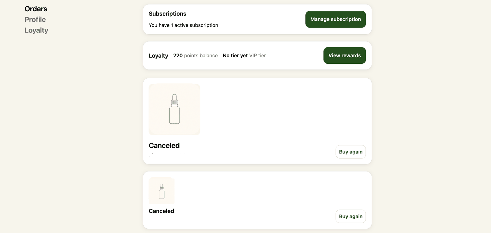
The loyalty half: defining it, then getting it built.
Essential Loyalty had already been selected — choosing the platform was not my call. My contribution was defining what the account experience needed beyond the default setup, and working with the app's developers to get it into the product.
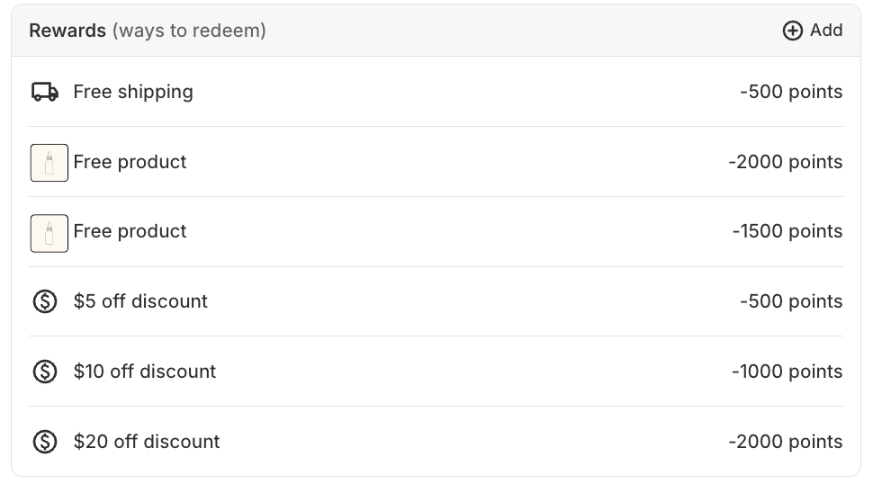
Their team added a customer-account widget showing the points balance and a button through to the rewards portal; the finished version also surfaced loyalty tier. I supplied the customer-facing requirement and reviewed the result; they implemented their app's side of it. Reward structure — free shipping, free products, and fixed discount tiers — was configured to match what the email campaign would later promise.
The subscription half did not exist, so I built it.
There was no ready-made widget for subscription status, so I wrote a Shopify Customer Account UI Extension for the Orders page: a heading, a count, and a button to the Skio portal. The copy is one line that changes with the count — “You have 1 active subscription”, or the plural form. At that moment a customer does not need a subscription dashboard. They need to know the system knows about their subscription, and where to go.
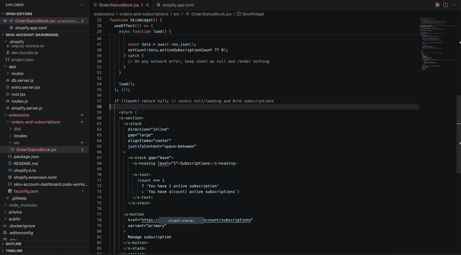
Behind that small interface sits the part that took the time. The extension sends a Shopify customer session token to a backend. The backend identifies the customer, queries Skio over GraphQL for their subscriptions, and returns the active count. Skio's API credentials stay on the backend — they are never shipped to a customer-facing extension.
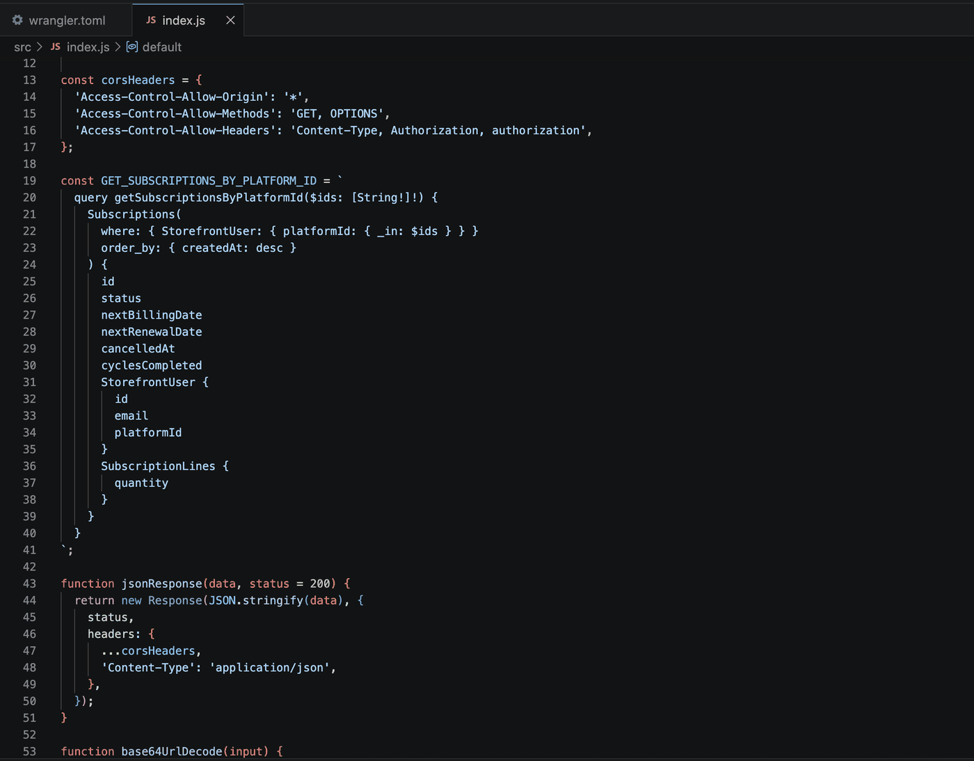
Getting two systems to agree on who the customer is.
Shopify and Skio do not describe a customer in the same terms. Working out the mapping — the Shopify customer GID against Skio's StorefrontUser.platformId — was the real work behind a widget that displays a single number.
There were GraphQL authorization errors to get through as well, and the useful skill there was separating three failures that look identical from the outside: wrong credentials or authorization format, a malformed query, and a request that worked perfectly but returned data I was not expecting.
The widget did not appear at all. The backend was returning zero active subscriptions — and it was right. The test customer's subscriptions were cancelled, and the widget counts only subscriptions with ACTIVE status. Reactivating one made the widget appear immediately.
That is the difference between a broken integration and a correct empty state, and knowing which one you are looking at saves hours of debugging something that was never wrong.
I then added the frontend handling to match: the widget stays hidden while loading, when no active subscriptions come back, and when the request fails. A failed call never leaves a half-rendered component sitting on a customer's account page.
My testing was functional — checking the expected Shopify identifier against the returned Skio record, inspecting subscription statuses, confirming behaviour after reactivation. It was not an independent security audit, and I would not describe it as one.
Sizing the backend to the job it actually does.
The backend started on Railway. I moved it to Cloudflare Workers because the integration only ever needed a small, request-driven endpoint: receive the request, identify the customer, query Skio, return a count.
This was not a response to Railway failing. It was a decision to stop maintaining more infrastructure than the task required. I have not attached a cost saving to it, because I did not measure one.
The account solved discoverability. It did not give anyone a reason to log in.
The wider programme used Omnisend to reach previous purchasers who were subscribed to email. Rather than announcing a rewards scheme in general terms, the message showed each recipient their own points balance — and used conditional content to translate that balance into the discount it was actually worth.
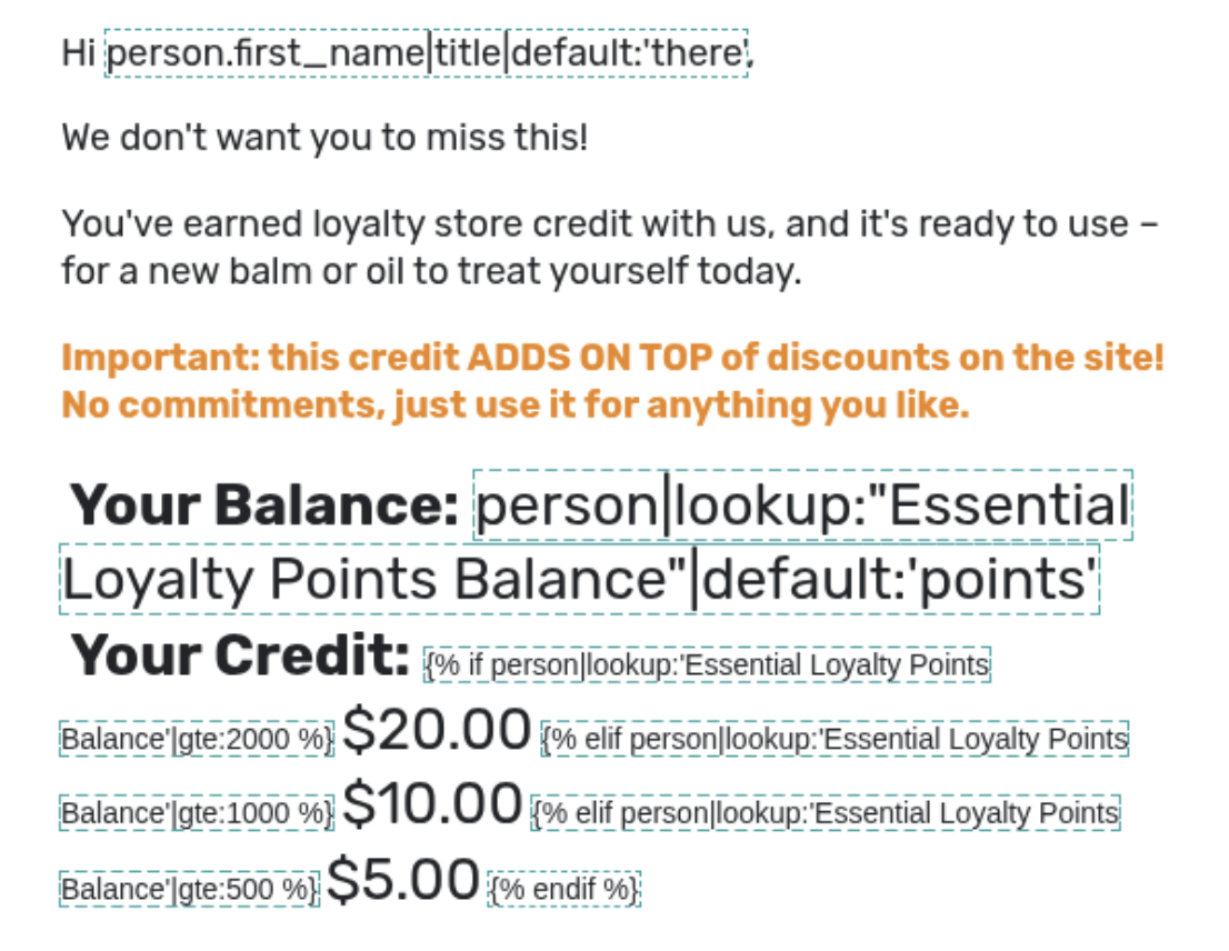
The CTA went straight to the redemption portal rather than routing people through the Shopify account first. The email and the account widgets were doing complementary jobs: one creates the return visit, the other makes the services discoverable once someone is already there.
What the numbers showed, and what they did not.
| Campaign measure | Reported result |
|---|---|
| Emails delivered | 6,928 |
| Opens | 2,164 |
| Open rate | 31.24% |
| Clicks | 28 |
| Click rate | 0.40% |
| Attributed orders | 4 |
Separately, 32 customers claimed loyalty rewards. That is a programme-level figure — not a claim that this one email produced all 32 redemptions.
| Period | Returning-customer rate |
|---|---|
| April | 59.92% |
| May | 50.10% |
| June | 64.52% |
| July | 65.56% |
| August (snapshot) | 68.01% |
June to the August snapshot is a rise of 3.49 percentage points. I do not attribute it to this project. The rate was already climbing before the late-June launch, and the August figure was taken before month end.
What I can stand behind is narrower and more useful: the connected account functionality works, customers claimed rewards, and the email platform attributed four orders to the campaign. A 0.40% click rate tells me the first version of the incentive was a starting point, not an answer.
What I would do with another two weeks.
- Measure the account journey directly. How often is each widget seen, how many people follow its link, how many then redeem a reward or manage a subscription? That would let me evaluate the account changes separately from the email, which this data cannot do.
- Test the incentive framing. Does leading with the redeemable value beat leading with a points balance? The conditional content makes that an easy test to run.
- Revisit the zero-subscription state. Hiding the widget keeps the page clean, but a lapsed subscriber may be exactly the person who would use a route back to reactivation.
These are proposed next steps, not work already delivered.
Client identity and product category are omitted, and the client store domain is redacted in the code screenshots. The account interface and email example shown here are recreated demonstrations using fictional customer data, not reproductions of client-owned source code.
Testing a more persuasive path to checkout
The storefront worked. It just left customers on their own between reading about a product and pressing checkout. I built a modified journey across three connected moments and ran it against the original.
The problem was not on any single page.
Customers could view a product, choose an option, add it to the cart and check out. Nothing was broken. The opportunity only became visible when I looked at the whole route instead of judging each page on its own.
- On long product pages, the purchase action scrolled away while people were still reading. By the time they had decided, the buy box was far above them.
- An empty cart offered a message and a generic link back to the store — a dead end at exactly the moment someone was willing to look at something.
- A cart with an item in it had the expected controls and a checkout button, and little else. No answers to last-minute doubts, no relevant second product.
Hypothesis: if customers get clearer purchase routes, stronger reassurance and relevant suggestions throughout the journey, more of them will continue from considering a product to completing a checkout.
One experiment, three connected changes.
The original storefront stayed as Version A. A duplicated storefront became Version B and received the new work: more accessible purchase actions on product pages, a redesigned cart, and an optional one-time offer before checkout. Conversion rate was the primary goal; add-to-cart rate, orders, revenue, revenue per visitor and average order value provided context.
Because the three changes were tested together, the experiment measures the modified journey as a package. It can tell us whether Version B performs differently from the original. It cannot tell us which of the three did the work — and I have been careful not to claim otherwise.
Keeping the purchase action within reach
The product pages carry education, evidence, reviews and supporting information. That content helps people decide — and it also means the buy box is a long way up by the time they have. I added further routes back to the product picker and a custom sticky purchase bar that appears once the main purchasing section leaves the screen. Its action returns customers to the relevant picker rather than guessing what product or quantity they wanted.
Turning the empty cart into a route forward
I put a curated selection of best sellers directly inside the cart drawer, each with an inline add button so nobody has to leave the cart to take one. That meant handling the transition properly: after an asynchronous add, the drawer has to refresh and move cleanly from its empty state into a populated cart, with the count, contents and totals all in agreement.
A cart that does more than total things up
- Free-shipping progress — a bar showing how much is left to qualify, updating as products and quantities change. A store rule turned into a visible customer goal.
- Cart reservation messaging — a time-based note adding light urgency around items that could sell out.
- “You may also like” — recommendations that exclude what is already in the cart, added asynchronously with a loading state and no page reload.
- Reassurance near checkout — returns, product quality and trust messaging placed where someone is still deciding whether to continue.
- Cleaner quantity behaviour — reducing an item from one now removes it properly instead of leaving a disabled, confusing control.
One optional offer before checkout
Selecting checkout opened a modal with a single complementary product at a one-time saving, chosen because it works as a broadly relevant addition to the range. Two clear choices: add it and continue, or decline and go straight to checkout. Accepting added the correct product asynchronously and applied the promotion; declining preserved the normal route. The modal appears once per browser session, so the same person is never interrupted twice.
Switch between the two versions yourself.
The prototype below recreates the structure of the experiment with a fictional store. Switch between A · Original and B · Modified, then move through the four moments: product page, empty cart, cart with an item, and the checkout moment. The design-notes view explains the thinking behind each addition.
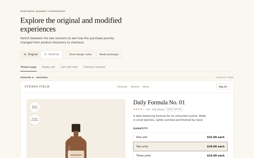
This prototype could not be embedded in the page. It opens in its own tab — switch between version A and B, then walk through the four moments in the journey.
Open the prototype ↗If the embed does not load, open it full screen using the link above.
The first visual version was nowhere near ready to run.
This is the part of CRO work that does not make it into case studies, and it is the part that decides whether an experiment measures your idea or measures your bugs. Hands-on testing turned up all of the following:
- Recommendation buttons did not reliably add products.
- The cart drawer did not always refresh after an asynchronous add.
- The empty state did not always transition cleanly into a populated cart.
- Quantity controls behaved unclearly when only one item remained.
- Customers had no visible feedback while a cart request was processing.
- The custom sticky CTA conflicted with an existing app-generated purchase bar.
- Some redirect behaviour opened the cart before trying to continue.
- The pre-checkout offer referenced the wrong product variant.
- The offer's product image did not render in an early version.
- Desktop and mobile needed separate spacing and width work.
A conversion feature can look completely persuasive in a mockup and still cost you sales if the cart refreshes incorrectly, a button adds the wrong item, or a mobile layout covers the next action.
Reading an early lead carefully.
At the time of writing, Version B was slightly ahead of the original on add-to-cart rate, conversion rate, order volume, revenue, revenue per visitor and average order value. The testing platform gave Version B the stronger win probability — and the experiment was still below its predefined confidence threshold, with substantially more orders needed to reach it.
Version B shows a consistent positive direction. The evidence is not yet strong enough to call a winner, and saying so is not hedging — it is the difference between a result and a guess.
Exact visitor, revenue and conversion figures are withheld here to protect confidential commercial information.
The other honest limitation is the bundling. Testing all three changes together answered a useful first question — does this direction show enough potential to keep exploring? A follow-up programme would isolate the parts: the cart redesign tested separately from the pre-checkout offer, and the sticky CTA separately again.
Conversion work is a connected-systems problem.
A product-page change affects how customers arrive in the cart. Cart recommendations affect quantities, totals and shipping progress. A pre-checkout offer affects cart state, discounts and the route into checkout. Every element you add to improve conversion also adds new states that can fail.
Client identity, exact figures and proprietary code are withheld. The prototype is an original portfolio recreation using a fictional brand, products, copy and prices. It demonstrates the structure and interactions of the experiment without reproducing client assets.
From a borrowed pattern to a brand-owned sales page
A strong landing page rarely arrives in one attempt. This one started as competitor research, went through a configurable offer and a full visual rebuild, and ended as the page the business kept.
Borrowing a structure is not the same as copying a page.
The business wanted a focused page for one of its main acquisition products. Rather than starting from nothing, we looked at a competitor page that already presented a similar offer clearly, and I studied how it moved a reader from the first promise through evidence and product education to the buying decision.
I used that structure as a hypothesis, not a template: could a focused long-form journey make this product and its value easier to understand than a conventional product page? The messaging, imagery, claims and purchasing logic were all replaced with our own. Then I built it inside Shopify as custom sections, so content, labels, images and offer settings stayed editable without rebuilding the page.
The real opportunity was inside the buy box.
A single purchase option did not communicate the value of buying enough product to actually use it consistently. So we built a custom picker with one-, two- and three-unit supplies — and made each option explain more than a quantity.
- Roughly how long that supply lasts
- Total price and price per unit
- The saving at each level
- Which option most people choose
- Where free shipping begins
- Which purchase includes a complimentary gift
The higher-value option got stronger visual emphasis and eventually became the default selection, so the page could recommend a route while keeping the others one tap away. Changing the selection had to update the active state and the price, and then map correctly to the Shopify quantity and checkout destination.
A free gift is a merchandising decision and a technical rule at the same time.
Showing a gift in the picker is the visible five percent. The rest is making sure the promise on the page is what the customer actually receives:
- Add the correct gift product to the cart
- Apply the discount that keeps it free
- Preserve the selected quantity of the main product
- Keep the picker's image, wording and checkout result consistent with each other
- Explain the benefit without crowding the interface
Partway through iteration, the gift attached to the largest offer changed. That single commercial decision meant updates across the customer-facing design, the product mapping and the Shopify discount configuration — three places that will happily disagree with each other if nobody checks.
A section can look right in the editor and still fight the storefront.
I tested the page the way a customer uses it: desktop and mobile, navigation between sections, offer selection, cart behaviour. That surfaced problems well beyond the picker.
The page had to coexist with global theme components — the announcement bar, sticky header, search interface and cart drawer. Adding page-specific campaign messaging caused overlaps and stacking problems in some states. I worked through those by adjusting page logic, spacing and component behaviour, and built targeting controls so campaign elements appear only on the landing pages and collections they belong to.
The first version worked. It still looked like someone else's page.
The structure did its job, but the visual language did not represent the brand. Spacing, hierarchy and presentation needed more character. Rather than keep adding styling overrides, I developed a new visual iteration with a warmer, more editorial direction: more distinctive typography, clearer section rhythm, a shorter hero, stronger separation between education, evidence and purchasing, a redesigned buy box that was easier to scan, and dedicated mobile layouts for the elements that needed them.
The commercial journey stayed familiar. The experience finally belonged to the brand.
The long-form page, rebuilt.
Below is an original recreation of the page architecture, offer hierarchy and picker behaviour, using a fictional brand called Ambra. Scroll the full journey, then try the supply picker to see how selection, savings, shipping and the gift interact.
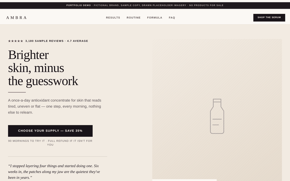
This recreation could not be embedded in the page. It opens in its own tab — scroll the full page, then try the supply picker.
Open the prototype ↗If the embed does not load, open it full screen using the link above.
Three stages, three questions, one retained page.
| Stage | The question it answered |
|---|---|
| Initial landing page | Could the reference structure be adapted into an effective sales journey? |
| Multi-unit picker | Would a clearer quantity offer and a complimentary gift improve the proposition? |
| Brand-aligned redesign | Could stronger visual identity and hierarchy improve it further? |
We reviewed each meaningful change in the live storefront, including how the offer behaved and whether the page worked as a coherent customer journey. The later brand-aligned version became the page the business kept.
This was an iterative landing-page project, not a controlled A/B test. I do not have evidence that isolates the commercial effect of each version, so I do not claim a conversion uplift.
The outcome is still meaningful: we built successive live versions, checked their implementation and fit with the offer and brand, and retained the final direction.
Merchandising cannot be separated from implementation.
A gift, a saving or a recommended option has to stay accurate from the first impression all the way into the cart. Competitor research is a useful starting point; a page only becomes valuable once it has been adapted to its own customer, offer and brand.
Client identity, product category and commercial figures are withheld. The recreation uses fictional branding, products, copy, imagery, prices and results, and does not reproduce client assets or proprietary code.
From a crowded catalogue to one clear recommendation
More than two dozen products, several of which solve overlapping problems in different formats. A customer arriving without prior knowledge has to become an expert before they can buy anything. So I built a conversation instead.
A collection page asks the customer to do the retailer's job.
Some products support more than one goal, and related products appear in different formats. A new customer therefore has two questions before they can even start: which product is relevant to me, and which format fits how I actually live?
A conventional collection page hands both questions back to the customer. A very short quiz narrows the catalogue, but the result can feel arbitrary if nobody can see how it was reached.
I wanted the recommendation to feel considered — which is a design problem before it is a logic problem.
Thirteen questions, and a reason for each one.
I researched established guided-selling and direct-response quiz patterns, then adapted the recurring principles into an original journey: one question per screen, a simple immediate action, a visible progress indicator, movement from a broad goal towards specific circumstances, and an acknowledgement of important answers before continuing.
Most questions are followed by a short reflective screen, making roughly 26 screens including the introduction, transitions and result. The length is the point: each step contributes either to the product selected, the format recommended, or the explanation shown at the end. Nothing is asked for the sake of feeling thorough.
The language changes with the path. Someone describing an occasional concern does not get the same response as someone saying it affects their routine regularly.
Branching rules, not a black box.
The prototype does not use an opaque model to choose a product. It uses rules anyone on the team can inspect:
- The first answer selects the relevant product family
- The second maps the specific concern to a primary product
- Later answers supply context for the personalised explanation
- A preference question can change the recommended format — for example, a ready-to-use balm instead of a concentrate that needs diluting
- A supporting product is selected without duplicating the primary result
The result page restates details from the journey and explains why the recommendation fits them. That creates a visible link between input and output: you told us this is what you experience, this is how often, and this is the kind of solution you would realistically use — so here is the one that fits.
It also means a product or marketing team can audit why a result appeared and revise the rules as catalogue priorities change. That matters more than sophistication.
Take the quiz.
Below is a recreation using a fictional brand, Meridian Botanicals, and a fictional catalogue of thirty products. Answer honestly and it will route you somewhere specific; answer differently and the copy, the reflections and the result all change with you.
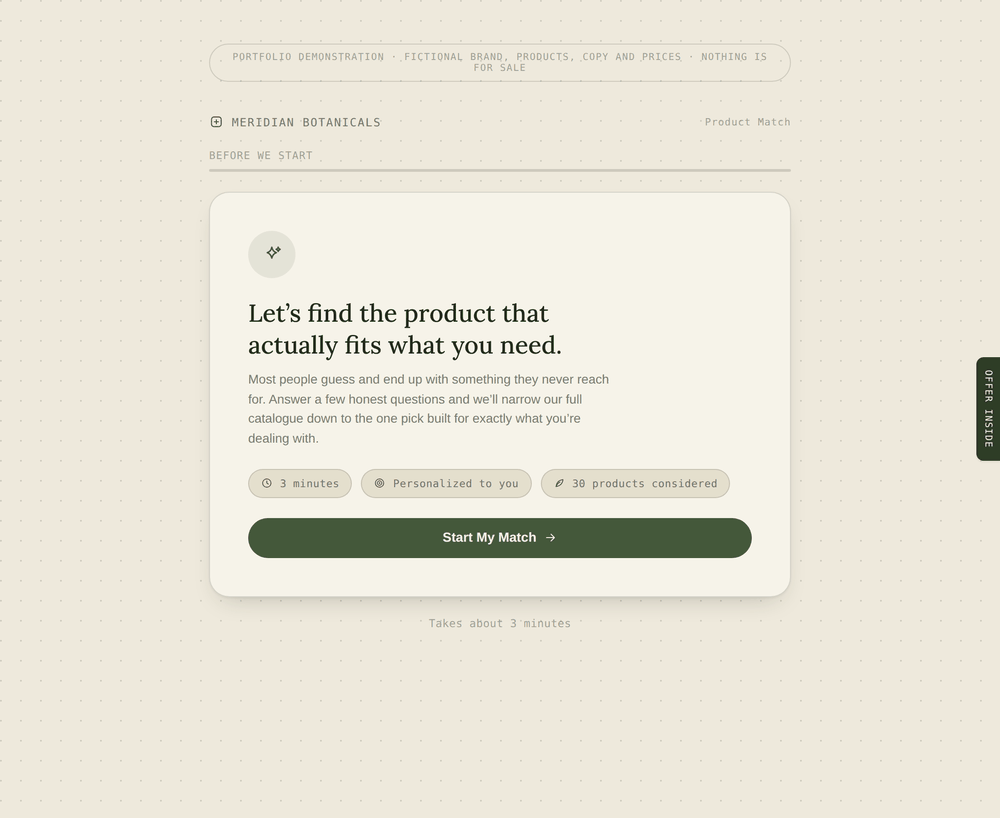
This prototype could not be embedded in the page. It opens in its own tab — the quiz takes about three minutes.
Open the prototype ↗If the embed does not load, open it full screen using the link above.
The first version was too short, and that was the important judgement.
AI accelerated the copy, the frontend and the revisions. The quality of the experience depended on what I did with it: supplying the business problem, the customer-journey references and the product context, then deciding that the first output did not build enough confidence in its own recommendation.
That single piece of feedback changed the project. It grew from a short product finder into a guided experience with more specific follow-up questions, a clearer sense of progression, reflective messaging, more customer context on the result page, a benefit-based question that affects the final recommendation, and a supporting product tied to the customer's stated preferences.
This was not a one-prompt output. It was defining the behaviour, inspecting the result, naming what felt incomplete, and pushing it towards a coherent journey.
Three defects that only appear once you look at the page.
A promotional element broke the layout
A small promo element meant to sit beside the quiz instead became a second item in the page's flex layout and squeezed the experience into a narrow column — badly on mobile. Taking it out of normal layout flow and repositioning it as a slim fixed ribbon restored the intended width.
The personalised result copy fell apart
Result sentences contained bold phrases highlighting the customer's own answers. In the rendered page those phrases became separate columns instead of flowing inside the sentence. It first looked like a symptom of the width problem; when it survived that fix, I looked again. The real cause was the relationship between the bold text and a flex container. Wrapping the whole sentence in one text element restored natural wrapping while keeping the icon aligned.
This one mattered more than it looks. The result page exists to feel personal and considered. Broken sentence structure undermines the entire promise of the experience.
The calculation sequence ended too abruptly
The loading transition finished before it created any meaningful pause between the final answer and the recommendation. I asked for a longer sequence with changing status messages referencing the customer's selected direction — roughly six seconds with an animated progress indicator. It gives the journey a moment of resolution without pretending an advanced system is working behind the scenes.
What this prototype does not claim.
The journey includes an email step, but there was no CRM or secure backend to connect it to. The field is an interface only: it does not transmit or store personal information. A production version would connect to an approved email platform, record clear consent, and save quiz outcomes as customer properties for later personalisation.
The prototype was never deployed to customer traffic, so it has no completion, click-through or conversion results. Its outcome is the working experience itself — a testable model of how a large catalogue could be reorganised around customer needs instead of requiring customers to understand the catalogue first.
The next stage would be real users: abandonment by question, the distribution of results, product-page clicks, and whether the longer reflective format actually improves confidence in the recommendation or simply lengthens the journey.
The interactive recreation uses a fictional brand, catalogue, questions, copy and result logic. It demonstrates the structure and recommendation principles without reproducing client assets.
Personalization, attention and trust
Personalization can make an experience feel more relevant. It can also make people uneasy about how much a business knows. For my master's research I investigated that tension across shopping, social advertising and email — with a survey, an eye-tracking study and expert interviews.
Relevance is hard to judge from the business side of the screen.
Working in e-commerce means deciding constantly what a customer should see: which products to recommend, what an offer should say, when to follow up. Personalization promises to make those decisions more relevant to each person — but a recommendation can be technically accurate and still arrive at exactly the wrong moment, and an email can win attention while making its recipient uncomfortable.
How can businesses use personalization in ways that support customer attention and customer trust?
I examined AI personalization across the online customer journey using the established RACE framework — Reach, Act, Convert, Engage — to connect individual interactions to a whole experience rather than judging them one at a time.
Three methods, because they answer three different questions.
| Method | n | What it investigated |
|---|---|---|
| Online survey | 100 | Perceived usefulness, ease of use, trust, attitudes, purchase intention |
| Eye-tracking study | 11 | How visual attention differed between personalised and non-personalised interfaces |
| Expert interviews | 5 | Practical applications, implementation challenges, customer-experience risks |
For the eye-tracking study I built three pairs of interface mockups — an online store catalogue, a mobile social advertisement and an email inbox — each in a personalised and a non-personalised version. Personalization cues included recommendation labels, tailored ad text and a first name in an email context. Participants viewed each stimulus for ten seconds. I defined areas of interest in Tobii Pro Lab, then examined time to first fixation, viewing duration and fixation count, processing the data with Python and pandas.
These were controlled visual examples. They let me investigate responses to personalization cues without pretending to test a live recommendation engine or a real sales funnel.
Convenient and trusted are not the same thing.
Survey responses, seven-point scale
Mean score · n = 100 · neutral midpoint 4.0
Ease of use and usefulness both scored above neutral. Trust scored a full point and a half below it.
This distinction shaped the rest of the research. Making an experience convenient does not resolve anyone's concerns about how their information is being used. I used SPSS to examine the relationships between these measures, overall attitudes and stated purchase intention — which moved the work past the flat question of whether people “like personalization”.
Noticed sooner and held longer are two different outcomes.
In the storefront mockup, the personalised cue was noticed quickly:
I treat that as a finding about the tested interface rather than a universal multiplier, because the comparison involves different types of area rather than the same element in two states.
The social advertisement behaved differently — and the difference is the interesting part:
Social advertisement, headline and text area
Milliseconds · shared scale · n = 11
The personalised text was reached later but held attention for longer. Those are different outcomes, and choosing the wrong metric will tell you the opposite story.
This was a useful complication rather than a contradiction. It reinforced something I now apply to commercial work: pick the measure that matches the question you are actually asking. These observations describe visual attention — they do not establish better comprehension, stronger preference, or more purchases.
A system can be right about the customer and wrong about the moment.
The expert interviews covered segmentation, recommendations, content and automation in practice — and raised concerns about authenticity, human oversight, and communication that misses the customer's current situation.
The recurring example was personalization that looks relevant to a system and feels inappropriate to a person: continuing to promote something the customer has already bought. The question is not only whether a business can personalise an interaction, but whether that interaction still makes sense at that point in the relationship.
Attention, usefulness and trust have to be considered together.
The three methods do not measure the same thing, so I did not treat one as disproving another. Someone can notice personalised content and remain cautious about the data practices behind it — both are true at once. I revised my initial model to add an explicit trust and context filter between the technical application of personalization and the customer's response to it.
The framework produced practical recommendations: make recommendations useful for the customer's current situation; check recent actions, including completed purchases, before following up; explain personalization where transparency helps; keep human oversight where an interaction needs judgement; and evaluate outcomes beyond whether an element attracted attention.
What this study can and cannot support.
The survey used a non-probability sample. The eye-tracking study had eleven participants. The interviews reflect five practitioners' experience. The visual comparisons used static mockups and ten-second exposures. The framework was not deployed or commercially validated.
So this is exploratory work, not population-level conclusions, and it measured reported attitudes, stated purchase intention and visual attention — not sales and not long-term retention. A next step would be testing selected recommendations in a live customer journey, measuring task completion, feedback and commercial outcomes alongside engagement.
What this project gave me is the habit behind everything else on this site: separate an appealing idea from a measurable question, choose the method that reveals the part of the problem you care about, and be precise about what the evidence actually supports.
Based on my master's thesis, “Application of Artificial Intelligence in the Context of Personalized Marketing Along the Online Customer Journey”, VILNIUS TECH, 2026.
Turning a free sample into a fulfilment-ready order
“Try a surprise essential oil for free — just cover $2.95 shipping.” Simple offer. Delivering it meant checkout needed one consistent product while the warehouse needed a real SKU, and those two things could not be the same item.
One offer, two requirements that contradicted each other.
The customer journey had to stay short: land on the promo page, claim one free oil, pay $2.95 shipping, receive something nice. No product to choose, no code to copy.
Checkout therefore needed one consistent product, because at that point nobody had decided which oil it would be. But the supply team cannot pack “surprise oil”. They needed the real Shopify variant and SKU.
Putting all six candidate oils on the page would have made the offer more complicated and dragged stock availability into the pre-checkout experience. Picking the oil by hand after every order would have been exactly the kind of repetitive manual work the automation existed to remove.
So I separated the two: a promotional product for the customer journey, and a real product decided after payment.
A placeholder product, and a checkout link that carried its own discount.
I created a generic free-oil placeholder product and used it consistently throughout the customer-facing journey. The Replo landing page presented the offer and sent customers into a checkout link generated through Skio, with the discount already attached — no code to enter, nothing to copy.
The Shopify discount was limited to one use per customer, which protected the promotion without adding a step to the journey. At checkout the customer saw one surprise essential oil at $0, plus $2.95 shipping.
The placeholder did two jobs at once. It gave checkout a predictable product to process, and it gave the post-purchase automation a reliable signal to look for.
The product decision moved to after payment.
Which oils could be given away was an operational question, not mine — colleagues in supply decided what could be spared. I configured six eligible variants inside the Mechanic task settings, editable without touching the automation, so the gift pool could change whenever stock priorities did.
When Shopify marked an order paid, the task checked whether it contained the placeholder. It could match on variant ID, product ID, product handle or SKU — four routes to the same answer, so a change to one identifier would not silently stop the automation. If no placeholder was found, it logged that and changed nothing.
If the placeholder was there, one of the six eligible oils was selected at random, and the order edit began.
- Retrieve the paid order — order, currency and the first 250 line items via GraphQL.
- Find the promotional product — locate the placeholder line and record its quantity.
- Select a replacement — sample one variant from the configured list.
- Begin the order edit — open a calculated order through the Order Edit API.
- Add the real oil — in the same quantity as the placeholder.
- Remove the placeholder — set its quantity to zero inside the calculated order.
- Preserve the free price — apply a 100% line-item discount to the newly added oil.
- Commit — only once every preceding step has succeeded.
No order-edit notification was sent to the customer: the change delivered exactly the offer they had accepted and did not alter what they paid. The committed order carried a staff note explaining that the surprise oil had been substituted automatically.
Run the automation against a fictional order.
Press run and watch the order change line by line. Then turn on Recreate the original failure and run it again — that is the bug the first version hit, and the reason the finished task is structured the way it is.
Order #1042 · paid
Status: awaiting automation
Mechanic task log
The task was passing the ID from the original order:
orderEditSetQuantity(lineItemId: "gid://shopify/LineItem/8842…")
Once an edit begins, Shopify works on a calculated copy of the order, so the edit mutations need the ID from that copy:
orderEditSetQuantity(lineItemId: "gid://shopify/CalculatedLineItem/8842…")
Fictional products, prices and order data. The sequence, the failure and the fix are the real ones.
The hard requirement was not making it work. It was never half-working.
A sequence that fails partway through an order edit can do real operational damage:
- The placeholder removed with no real oil added — an order with nothing to pack.
- The real oil added but the placeholder left behind — two gift lines.
- The real oil added at full catalogue price — a customer charged for a free gift.
- An order that reaches supply with no valid product on it at all.
So I built the process as discrete stages, passing the required order information between them, and checked what Shopify actually returned after each GraphQL action: the expected object, a calculated line-item ID, a staged discount, any userErrors, and a successful commit result. If a required operation failed, the task logged the problem and stopped — before committing. The order was only ever changed permanently once the complete replacement was ready.
Why the first version could not remove the placeholder.
The initial task detected the free-oil product and selected a replacement correctly, then failed on removal with an invalid line-item ID.
It was using the ID from the original Shopify order. But once an order edit begins, Shopify creates a calculated version of that order, and the subsequent edit mutations have to reference the CalculatedLineItem inside the active edit — not the original LineItem. The ID looked valid. It belonged to the wrong object.
The fix was to begin the edit, retrieve the calculated order, find the placeholder again inside it, and use that calculated ID for removal.
The failure produced a better structure than the original plan. Instead of assuming a line found before the edit could be reused throughout, every stage now works with the identifiers returned by the operation immediately before it.
The pricing needed a second correction
Setting the replacement product's price to zero was not an acceptable answer — the oil still needed its normal price for every other customer and sales channel. The final automation adds the real product at catalogue price and applies a 100% discount to that specific line within the promotional order. The discount is staged before commit; if Shopify does not confirm it was created, the task stops and leaves the original order untouched.
Tested as a customer, then checked as the warehouse.
- Mechanic preview runs before anything went near a real order.
- A real test order placed through the actual promotional journey.
- Confirmed the automatic discount reached checkout without a code.
- Confirmed the placeholder was detected after payment, and disappeared from the edited order.
- Verified exactly one real oil was added, and that it stayed free.
- Checked the final order carried a fulfilment SKU someone could actually pick.
- Monitored the first live runs rather than assuming.
This was an operational automation, not a conversion experiment, so success was whether the correct products, quantities and prices moved through the system. The offer launched and the replacement process worked; the total number of orders processed was not retained, so I am not quoting one.
Client identity and products are withheld. The interactive recreation uses fictional products, prices and order data; the sequence, the failure and the fix are as they happened.
Simplifying fulfilment without changing the customer experience
The picker made a complicated offer feel simple. Behind it sat a catalogue of variants describing product type, scent, pack size and load count — built around 60-load packages the business no longer stocked. The storefront still worked. The data reaching the supply team no longer described anything real.
When a storefront structure becomes an operational problem.
Every purchasing option was its own Shopify variant. One, three, six or twelve packs, each with a descriptive SKU:
Laundry-Detergent-Fresh-Scent-3-60-loads |
Laundry-Detergent-Fragrance-Free-6-60-loads |
Laundry-Softener-Fresh-Scent-1-60 |
Laundry-Softener-Fresh-Scent-3 |
Different quantities of the same physical product existed as separate inventory identities. That was survivable until the 60-load packages stopped being available — at which point a legacy SKU describing three 60-load packs could not be handed to fulfilment as three physical items. Supply needed a further rule explaining how to translate it into the 30-load packs that actually existed.
The customer saw a clear bundle choice. The supply team received an abstract instruction that needed decoding. They asked me to simplify it.
The obvious answer — redesign the product page — was the wrong one.
The business was no longer prioritising new acquisition for this product. The operational priority was serving existing subscribers reliably and making future recurring orders easier to process.
There was also no realistic time to audit every historical product page, advertorial, advertisement and external link that might still lead customers to this offer. Those entry points carry expectations about load quantities, subscription savings and how the options are presented. Changing the customer-facing offer without completing that audit risked telling customers something different from what had brought them there.
So I defined a controlled scope: preserve the customer-facing experience exactly, replace the catalogue structure underneath it, and move the product calculations into the picker.
Customers keep the same load options, prices, savings and delivery frequencies. Supply gets clean data describing the physical items they handle.
Bundle SKUs out, physical product SKUs in.
| Physical product | Simplified SKU |
|---|---|
| Softener sheets, scented | pw-softener-scent |
| Detergent sheets, scented | pw-detergent-scent |
| Detergent sheets, fragrance-free | pw-detergent-free |
Each SKU now represents one physical 30-load package. The number of loads a customer chooses became a purchasing rule rather than a separate inventory identity.
| Customer selection | Quantity sent to the cart |
|---|---|
| 60 loads | 2 × 30-load units |
| 180 loads | 6 × 30-load units |
| 360 loads | 12 × 30-load units |
| 720 loads | 24 × 30-load units |
The storefront still merchandises 60, 180, 360 and 720 loads. Shopify now records the exact number of physical units required, and nobody downstream has to interpret a legacy bundle SKU or maintain conversion rules in their own system.
The picker got harder so that everything downstream got easier.
From the customer's side the action is unchanged: select 180 loads, add to cart. Behind the interface, the same action now produces very different data. Drag the divider up to reveal the rebuilt implementation.
// The catalogue holds the bundle logic.
selectPack('180 loads');

const variant = variants.find(
  item => item.option === '180 loads'
);

addToCart({
  id: variant.id,
  quantity: 1
});
// The picker holds the bundle logic.
const packs = {
  60:  { quantity: 2 },
  180: { quantity: 6 },
  360: { quantity: 12 },
  720: { quantity: 24 }
};

selectPack(180);

const item = {
  id: fulfilmentVariant.id,
  quantity: packs[180].quantity
};

if (purchaseType === 'subscription') {
  item.selling_plan = selectedSellingPlan;
}

addToCart(item);
- The customer selected
- 180 loads
- Shopify records
- sku: "detergent-scent-3x60"
- Quantity
- 1 bundle unit
The customer still selected 180 loads. Only the operational instruction changed.
The rebuilt picker also took on displaying the load options, mapping each to the right physical quantity, calculating one-time and subscription totals, applying bundle savings, preserving delivery frequencies, attaching the correct selling plan, keeping the selected option in the page URL, and sending the right variant and quantity to Shopify. More logic in the interface — a substantially simpler catalogue to operate.
Fixing the product page only fixed future first orders.
Existing subscribers were still attached to the old Shopify variants through Skio. Left alone, their recurring orders would have kept generating legacy SKUs indefinitely, no matter what the storefront did — because recurring orders are built from the product and variant information already stored in each subscription.
So I updated the affected subscriptions so their future orders referenced the new SKU and the correct physical quantity. That is the half of the project that made it actually solve the problem rather than slowly diluting it.
New purchases used the rebuilt picker and the simplified SKUs. Existing subscriptions were moved off the legacy variants. The business did not have to wait for new customers to replace the old order structure for it.
The most visible outcome was that customers saw nothing.
Same load quantities, same one-time and subscription choices, same bundle savings, same delivery frequencies, same defaults, same journey. That continuity was the design decision, not the absence of one — a full redesign would have consumed the time without addressing the operational priority, and risked contradicting campaign messaging that could not be audited within the scope available.
- One inventory identity per physical product type.
- Cart quantities matching the number of physical packages required.
- No bundle interpretation required from the supply team.
- One-time and subscription purchases both supported by the new picker.
- Existing subscribers moved off obsolete variants.
An operational implementation, not a conversion experiment. Success was whether the correct products, quantities and subscription information moved through the system — not a change in conversion rate.
Client identity is withheld. SKU names and code excerpts are sanitised and simplified; they show the architecture without reproducing proprietary code or product IDs.
Eglė Šukytė — Shopify & e-commerce solutions specialist
E-commerce solutions specialist who translates commercial, customer-experience and operational problems into functional Shopify experiences. Hands-on across conversion-focused landing pages, custom purchasing journeys, subscriptions, product quizzes, automation, integrations and technical troubleshooting. Combines growth marketing knowledge with practical Liquid, HTML, CSS, JavaScript and GraphQL implementation.
- Shopify & digital product
- Shopify · Replo · CRO · product merchandising · responsive UX · A/B testing
- Build & automation
- Liquid · HTML · CSS · JavaScript · GraphQL · Mechanic · Shopify Flow · n8n · AI-assisted prototyping
- Integrations & operations
- Skio · APIs · Cloudflare Workers · DNS · SPF/DKIM/DMARC · cross-platform debugging
- Growth & lifecycle
- SEO · Google Ads · email marketing · Omnisend · Klaviyo · product quizzes
Shopify Content Administrator | E-commerce Solutions & CRO — Bold.One
Sep 2025 – Present- Support multiple international e-commerce brands, translating marketing, commercial and operational requirements into working Shopify and WordPress solutions.
- Automated promotional order modifications with Shopify Mechanic, Liquid and GraphQL, resolving order-edit errors and replacing repetitive manual processing.
- Diagnose cross-platform issues involving Shopify, Replo, Skio, Omnisend, Klaviyo, Cloudflare, Google Workspace and email authentication.
- Integrate custom and third-party product pickers supporting bundles, one-time and subscription purchases, delivery frequencies, dynamic pricing, variants and Shopify selling plans.
- Design, build and optimize conversion-focused landing pages and quiz-style customer journeys using Replo, custom frontend code and AI-assisted rapid prototyping.
- Plan and execute A/B tests across landing-page structures, offers and purchasing experiences, refining higher-performing variants using customer-behaviour and conversion data.
- Designed a personalized product-recommendation quiz connected to Omnisend, transforming answers into product recommendations and reusable CRM customer properties.
- Deliver localized e-commerce funnels for international markets, adapting landing pages, product experiences, checkout content and legal journeys.
E-commerce Manager — FIGARO salonų tinklas
Oct 2024 – Sep 2025- Managed day-to-day e-commerce operations, product content, promotions and digital merchandising for a beauty retail and services business.
- Coordinated online campaigns and customer-facing content across e-commerce, SEO, email and paid digital channels.
- Maintained storefront accuracy and supported improvements to the customer journey, product presentation and commercial performance.
Trust & Safety Content Moderator — Teleperformance
Apr 2024 – Sep 2024- Reviewed user-generated content against detailed policies, consistently balancing accuracy, quality and time-sensitive decisions.
E-commerce Manager — MakesYouLocal
Apr 2023 – Mar 2024- Supported international e-commerce growth through market research, local-market adaptation, SEO, product content, email marketing, influencer research and customer insight.
- Progressed from E-commerce Assistant to Manager within five months, taking greater ownership of client communication, execution quality and market-facing initiatives.
E-commerce Assistant — MakesYouLocal
Dec 2022 – Apr 2023- Assisted with localized store operations, content, customer support and marketing execution for brands entering new European markets.
- 2024 – 2026
- MSc Marketing Management, VILNIUS TECH. Research focus: AI-driven personalization across the online customer journey and its influence on consumer behaviour and business outcomes, using the RACE framework and mixed research methods.
- 2019 – 2022
- BA Creativity and Business Innovation, Vilnius University of Applied Sciences.
- Earlier
- Marketing Intern, DuGut App (2022) · Junior Operations Specialist Intern, SPIC AND SPAN (2021)
- Languages
- Lithuanian — native · English — full professional proficiency · Portuguese — basic · Russian — basic
- Work eligibility
- EU citizen — eligible to work in Ireland without sponsorship. Relocating to Dublin; start date negotiable.
To keep a copy: use your browser's print option and choose “Save as PDF”. This page is formatted for it.